Copper Council
Turning three friends, a copper still and a shared passion into a premium gin brand
Food & Drink
Brand Identity
The Challenge
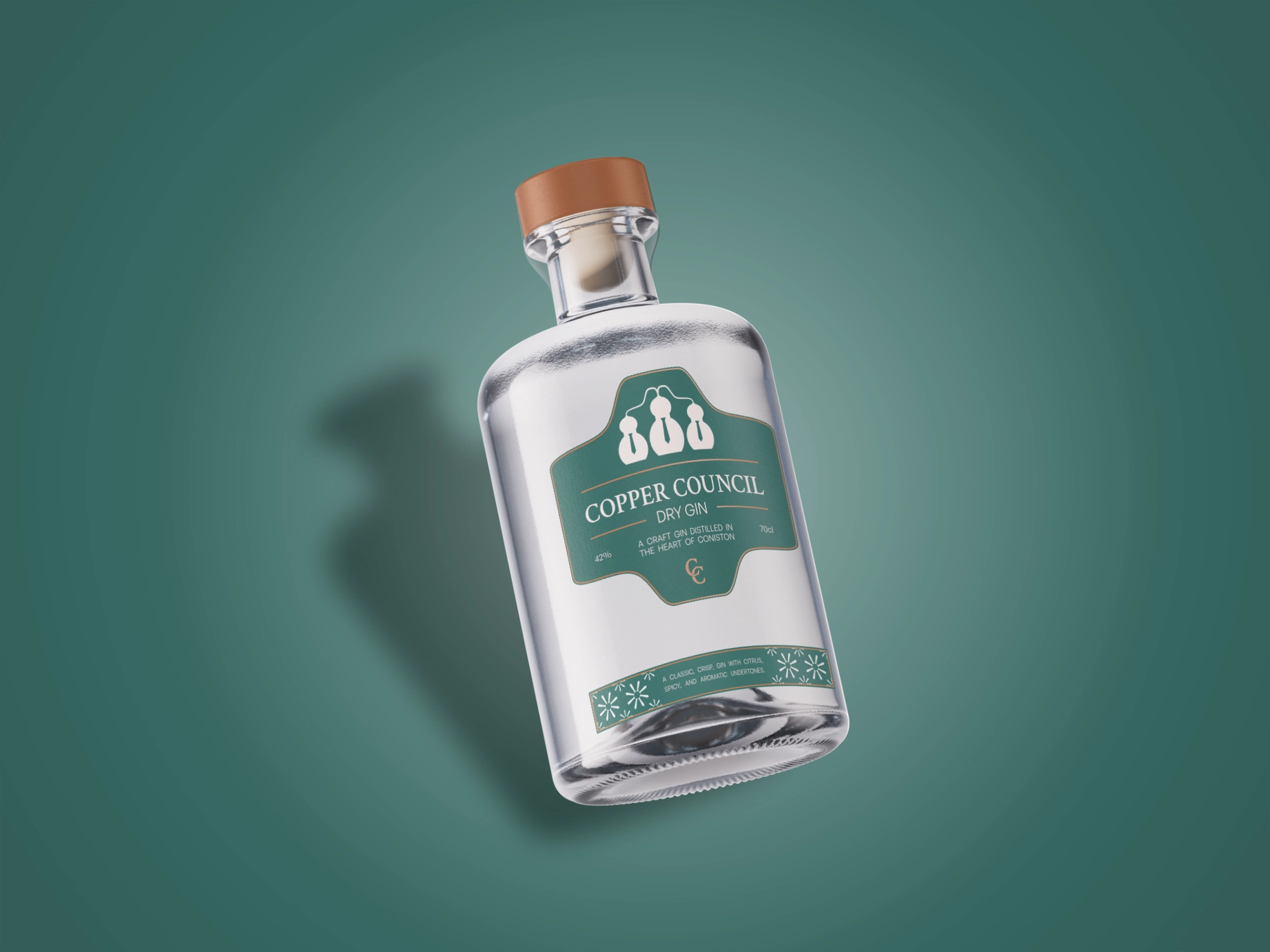
Copper Council was starting with a completely blank canvas. Founded by three friends from Coniston who shared a passion for gin, the business was built around small-batch distilling in their hometown, with the three founders taking a vote on the ingredients and quantities used in each batch. This process led them to nickname themselves the council, while the copper still they used to create their spirit completed the story behind the name.
With no existing identity or visual direction, the challenge was to turn that story into a brand that felt as considered as the product itself. Copper Council wanted to enter the craft gin market with a premium, sophisticated feel rather than following the more vibrant and quirky aesthetics often associated with contemporary gin brands.
The Solution
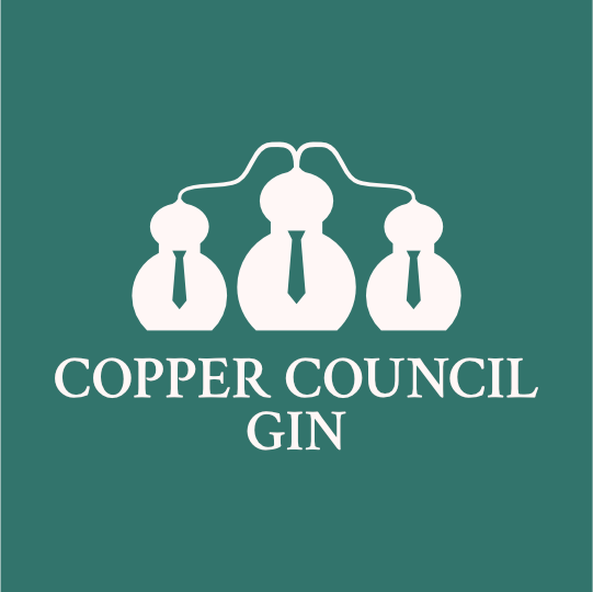
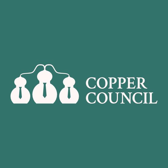
The logo was built directly from the three key elements of Copper Council’s story: three friends, the council and the copper still. I explored ideas around what a council could represent, like formality, integrity and unity, before combining these with the physical shape of a copper still. The outline of the still was simplified into a humanoid figure, with a negative-space tie introducing the idea of formal attire. Two additional figures were then added and connected using the shape of distillation condenser coils, creating a mark that reads as both a group of people and a collection of copper stills.
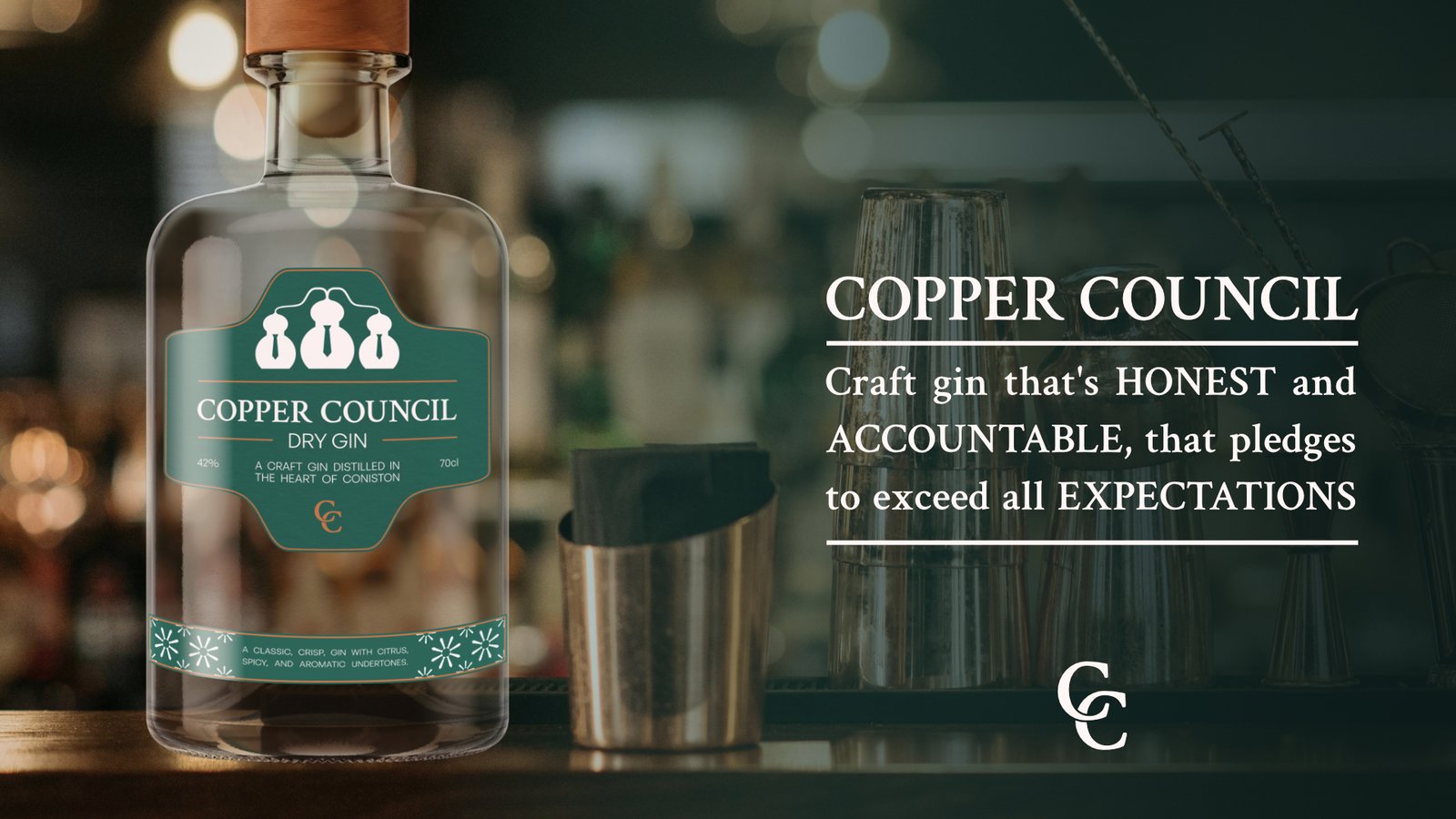
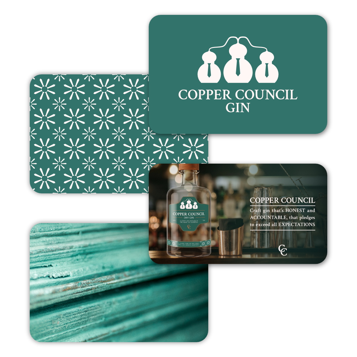
The rest of the identity was designed to reinforce this premium, formal character without overshadowing the story. The colour palette takes inspiration from the oxidisation of copper, pairing rich oxide green with contrasting copper tones, while imagery uses warm lighting, copper barware and cosy settings to evoke the atmosphere of a sophisticated speakeasy. Even the messaging follows the same thinking, using language around values such as accountability and words like “pledge” to strengthen the sense of formality and character.


The Result
Copper Council now has a brand with a clear sense of character and a story at its heart. By building the identity around the three founders, their unique voting process and the copper still, the brand has a visual identity that feels genuinely connected to its origins rather than simply designed to look premium. The result is a sophisticated and distinctive presence that gives Copper Council a strong foundation as it enters the craft gin market.