KasArtUK
A playful brand identity inspired by the art behind the artwork
Fine Art
Brand Identity
The Challenge
KasArtUK is a local artist specialising in pet portraits and abstract original artwork. What began as a hobby had gradually grown into a viable business, but there was no existing brand identity to bring the business and its artwork together.
With a blank canvas to work from, the challenge was to create something that reflected the warmth and character of Kathy’s artwork while giving KasArtUK a recognisable identity that could work across her growing business.
The Solution
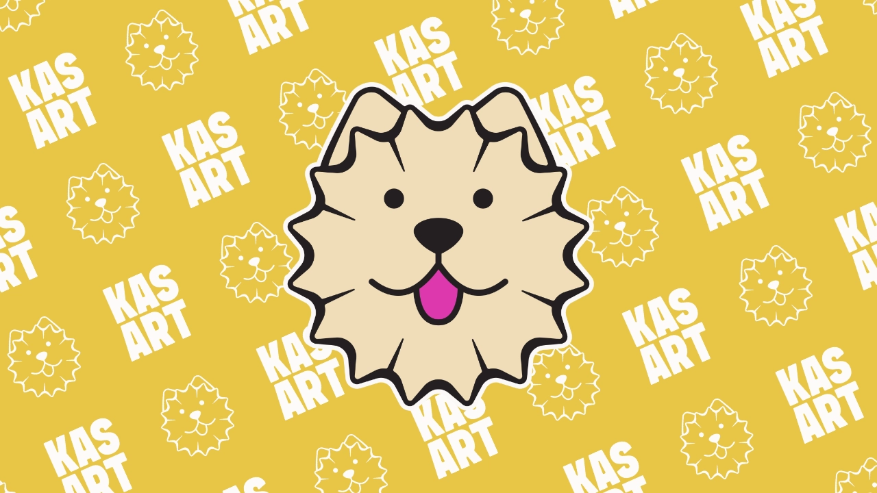
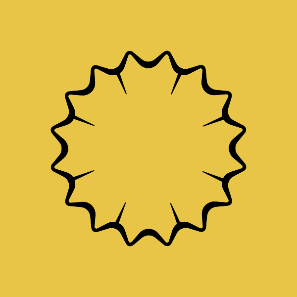
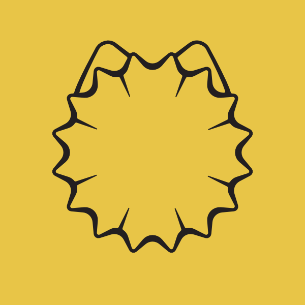
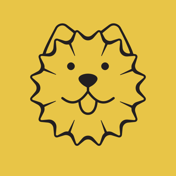
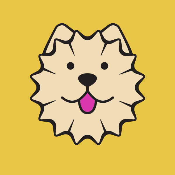
The concept started with one of the mediums Kathy uses most often: coloured pencils. Rather than simply using a pencil as a literal symbol, I looked at the shape of pencil shavings and how it could be transformed into something more relevant to her work. The shape was created from two rounded stars, and became the basis of a dog’s face, the curved outline was adapted to create ears. Simple facial features were then added to give the mascot a playful personality that reflected the character of Kathy’s artwork.
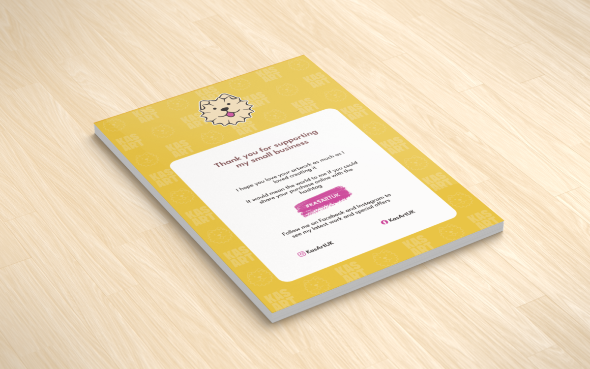
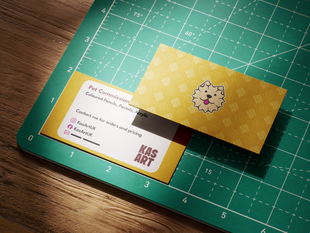
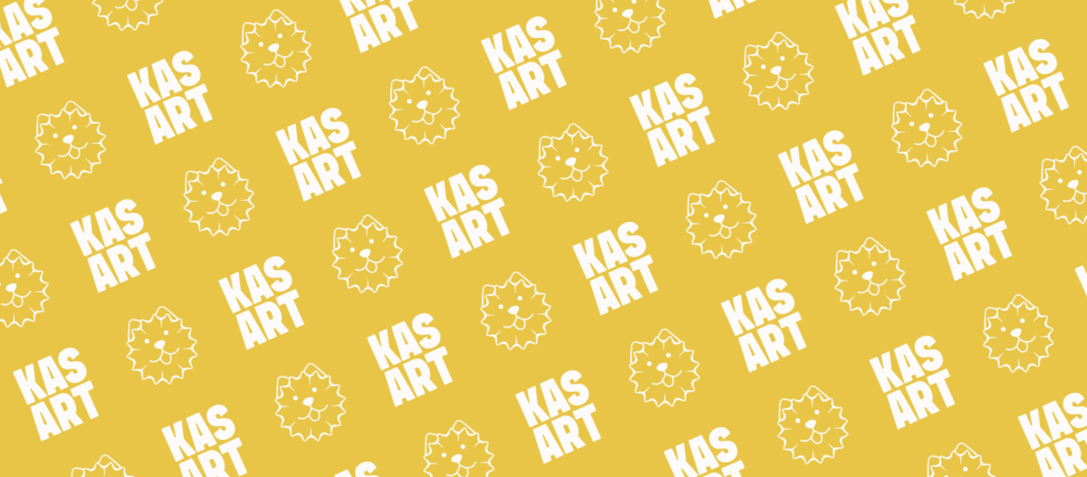
The rest of the identity was built to support the mascot without competing with it. A chunky, imperfect wordmark adds an organic quality, while a repeating pattern combines the mascot and wordmark to create a flexible graphic asset. The pattern can be scaled and applied across everything from social media and printed materials to packaging, giving KasArtUK a simple visual system that extends beyond the logo.
The Result
The result is a playful and recognisable identity that captures the creative personality of KasArtUK while giving Kathy a consistent foundation for her growing business. The mascot provides a memorable connection to both her pet portraits and artistic process, while the supporting assets give her the flexibility to carry that identity across different touchpoints.